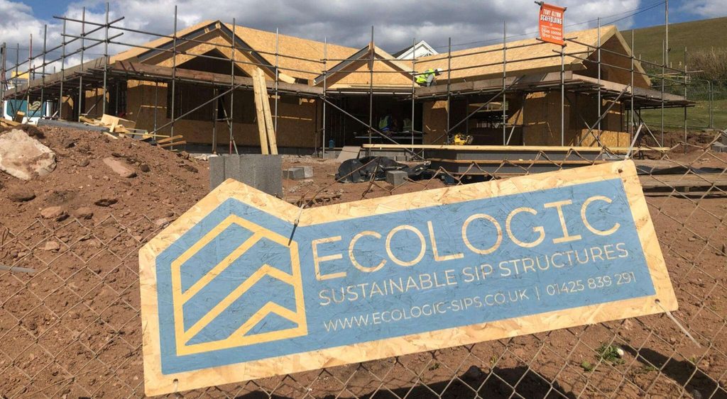
Ecologic SIPs is a UK‑based specialist in designing, manufacturing, and installing Structural Insulated Panels (SIPs) from their workshop in the New Forest, Dorset. For over 20 years, they’ve championed high‑quality, eco‑friendly construction, creating modular, design‑led homes like luxury beach lodges, garden annexes, and clifftop residences.
Core Vision & Values
They aim to empower homebuilders and industry professionals to create design‑led, eco‑buildings using sustainably sourced materials and low‑impact methods. Guided by Care, Inspire, and Craft, they prioritise resource efficiency, airtightness, zero cold-bridging, and energy‑efficient solutions often integrating MVHR ventilation, triple glazing, and renewable PV options.
In this project, my mission was to rebrand Ecologic SIPs, transitioning them from their previous market to a new audience with a different set of products and services.
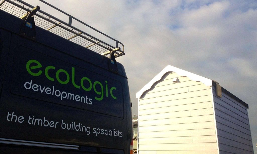
Ecologic previously had a logo and visual identity that represented their original business model. But when that model changed, it no longer felt like a good fit for them.
That’s why a rebrand was necessary, they started communicating with a different type of client and entered a new market.
And this is what their old logo used to look like.
So the goal was to create a new identity that fits the new direction. And like with any project, we start with a strategy session where we define all the objectives and everything we need to work on to get the best possible result.
One of the most important steps after setting the strategy is to study the environments where the branding will appear in a physical sense.
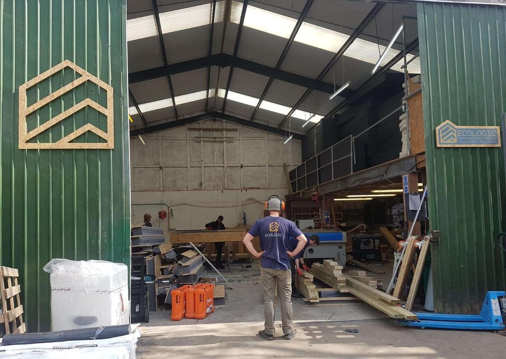
We found that the visual branding would show up across a lot of materials and textures—like wood, uniforms, equipment, stickers, and so on.
Once we’re done with that phase, we move on to building a moodboard to inspire us and help guide the creative direction.
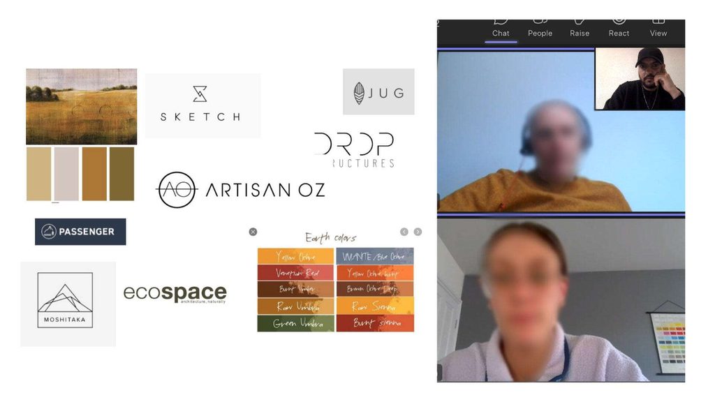
After defining the moodboard and setting a fitting art and creative direction, we moved on to the concept development phase.
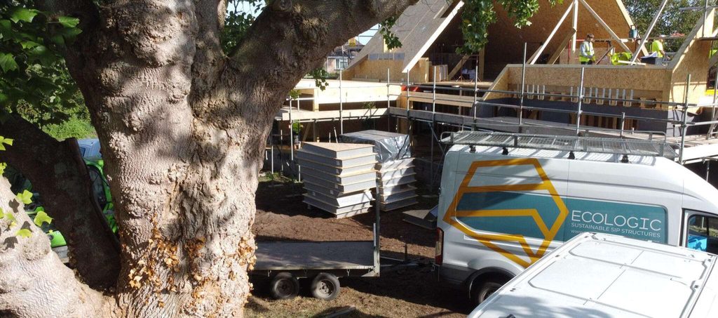
In construction-focused companies, it’s common practice to display their logo at the worksite so people know which company is handling the project.
That’s why the logo needed to be expressive, it should reflect the nature of the company’s activity. At the same time, we had to consider other environments where the branding would appear, like digital platforms and product packaging.
Of course, all of this had to respect core design principles: the logo had to be simple, unique, and not overloaded with details, so it could be easily applied across different mediums.
Our main creative idea for the logo was to work with an icon that represents the essence of their work. But we also explored other directions, like abstract forms or playing with the first letter of the brand’s name.
We put all these ideas into sketches and began working on the first draft.
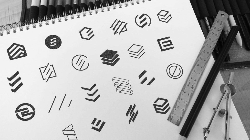
So after we created the first sketches, we selected the icon that stood out the most and that the whole team agreed on.
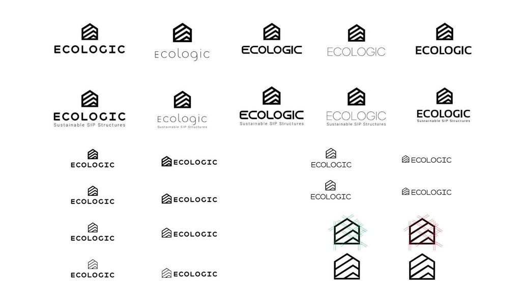
Then we moved on to the next step, which was testing that chosen icon with different fonts. We also explored various thickness options to find the right balance between shape and typography, making sure the final combination felt just right.
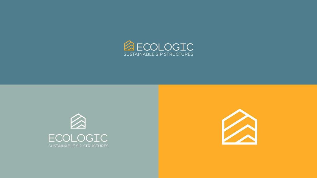
After we locked in the right icon with the right font, the next step was to choose a color palette and test everything through mockups.
In the end, we selected the option that looked the best, one that everyone agreed on as the strongest and most fitting direction. That option became the new visual image of the brand.
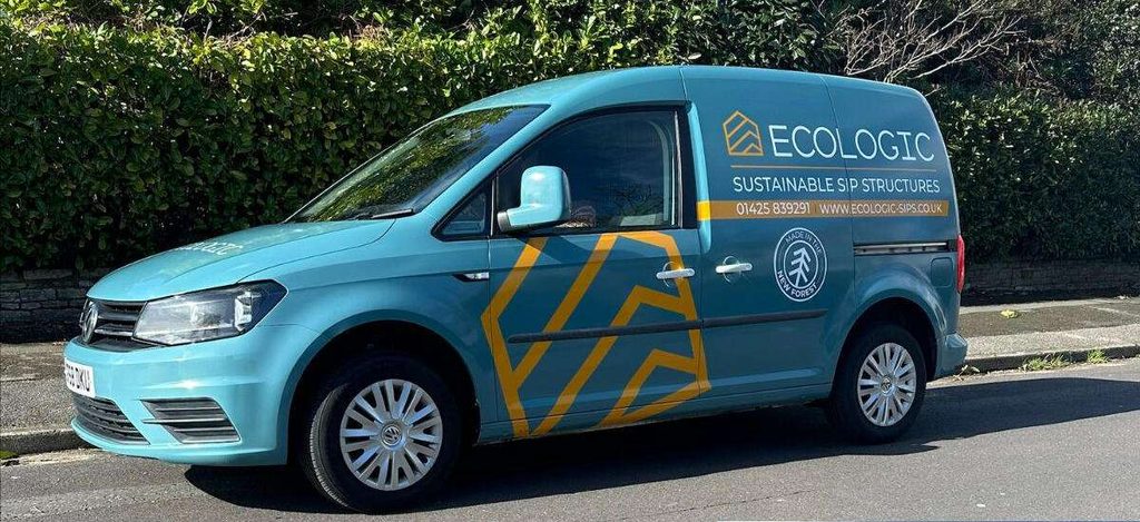
As for the mockups, it was essential to test the selected designs across all the environments we identified in the initial phase.
We needed to explore as many realistic mockup scenarios as possible before moving to the final presentation, ensuring that the design worked well in every context and gave us a clear, accurate picture of how it would perform in the real world.
Here are a few examples we explored.
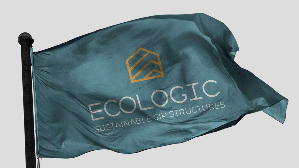
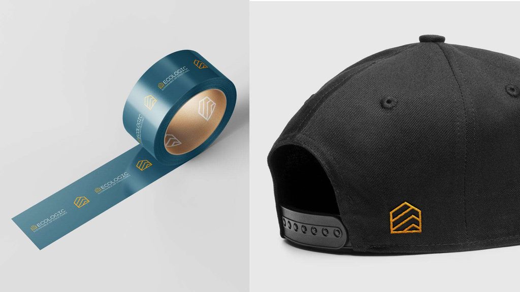
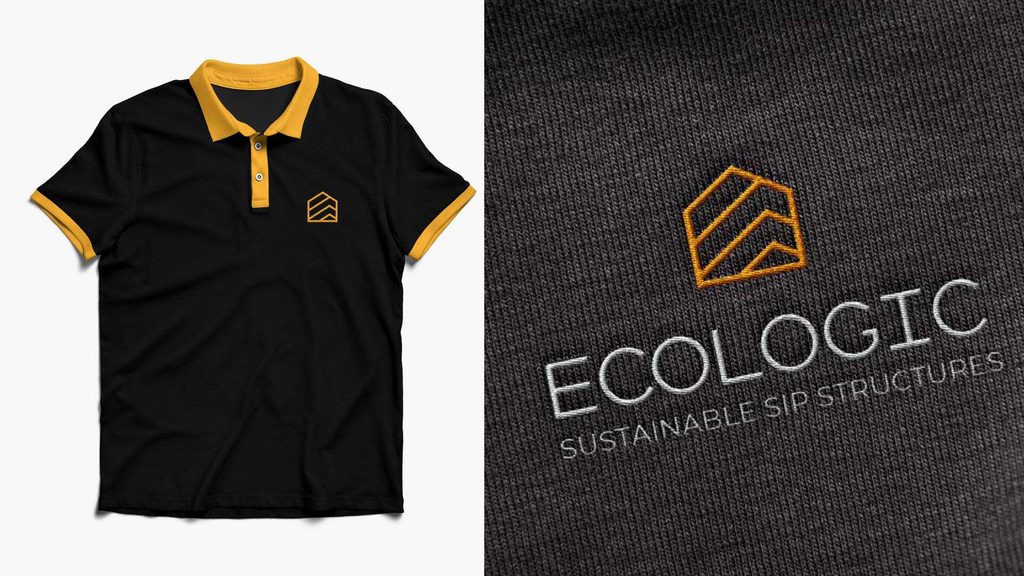
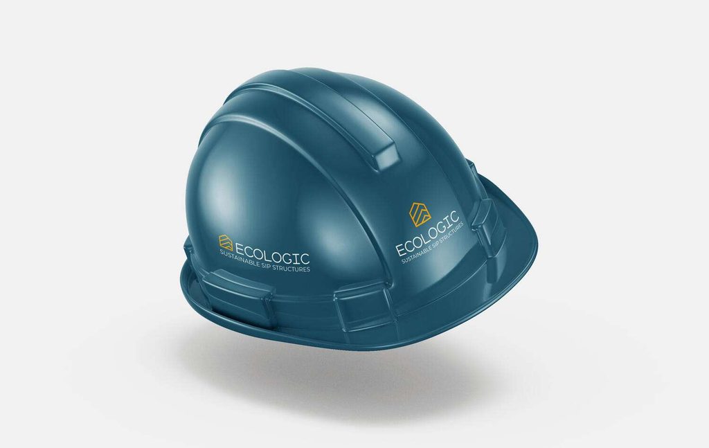
Once we were confident that the logo and visual identity would perform well across all the environments we worked on, we were ready to move into the final phase, seeing everything come to life in the real world.
Thankfully, everyone was happy with the result and proud of the new identity.
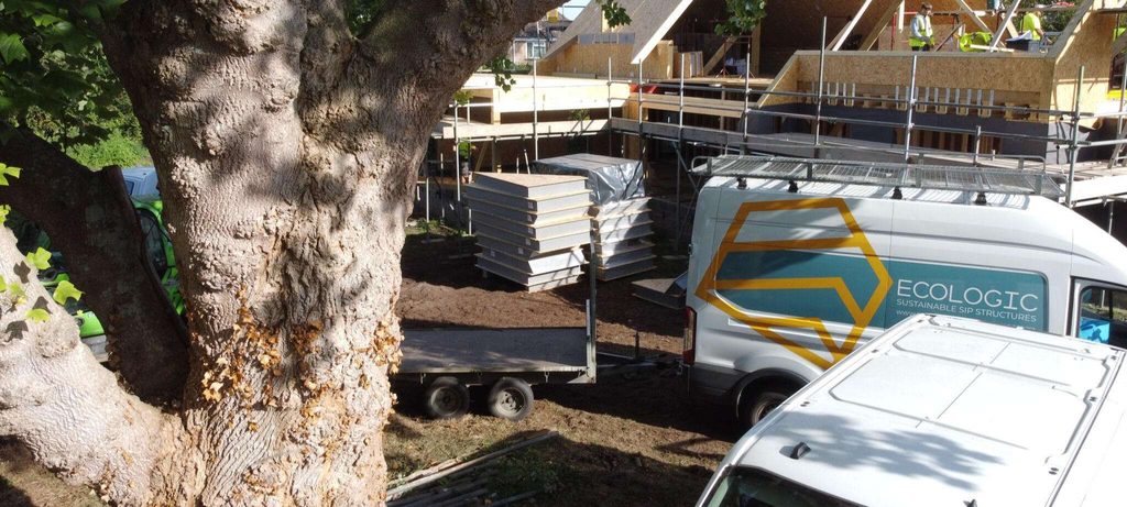
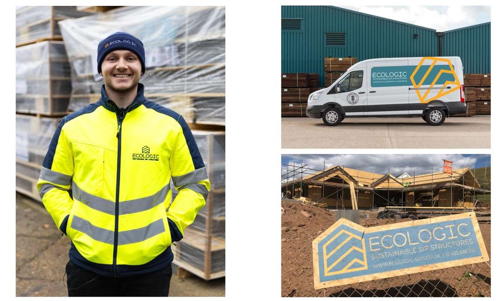
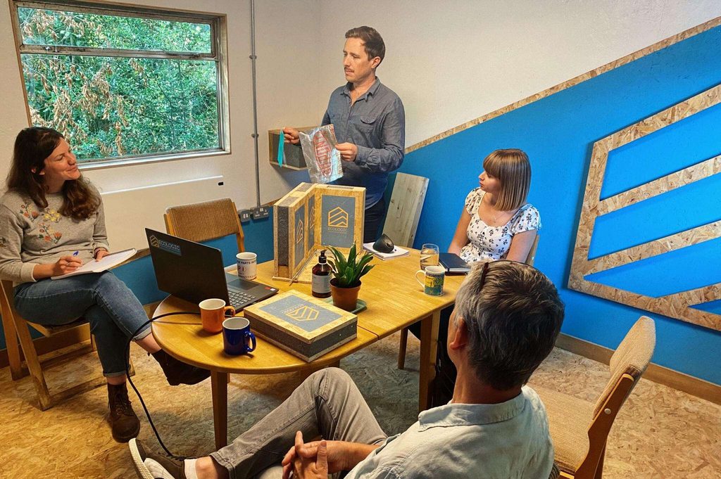
And after years of working with this new visual identity, these were the real-world outcomes.


Sustainability First
The Ecologic project was truly a pleasure to work on, not just because it was a branding job, but because it was built on values that matter.
The people behind it genuinely care about nature and the planet, and that’s something worth respecting and supporting.
It’s hard not to admire brands that stand for something bigger than just profit, brands driven by purpose and vision.
You can see how Ecologic’s transformation came to life in the real world.