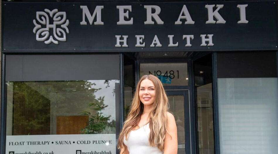
Meraki Health UK is a modern wellness studio based in Aberdeen, UK, offering science-backed recovery and relaxation experiences through private floatation therapy, Finnish-style sauna, cold plunge, and contrast therapy. Their mission is to help individuals reset their mind and body in a calm, restorative environment just minutes from the city centre.
As a premium health and wellness brand, Meraki Health stands out for its commitment to evidence-based therapies, minimalist design, and client-centered experience. Their approach combines ancient healing methods with modern science to support physical recovery, stress resilience, and long-term well-being.
My main mission in this project was to create a visual system that reflects the brand’s vision and values
which can be summed up in the following keywords:
premium – health and wellness – healing – therapy – minimalist – client-centered experience.
Every design choice was guided by these core principles to ensure the visual identity feels aligned with what the brand stands for.
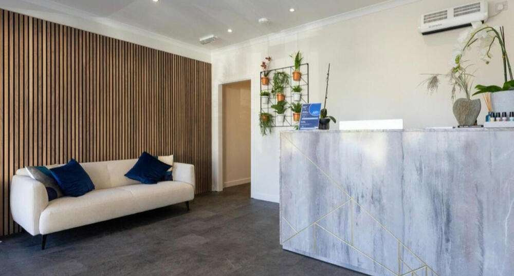
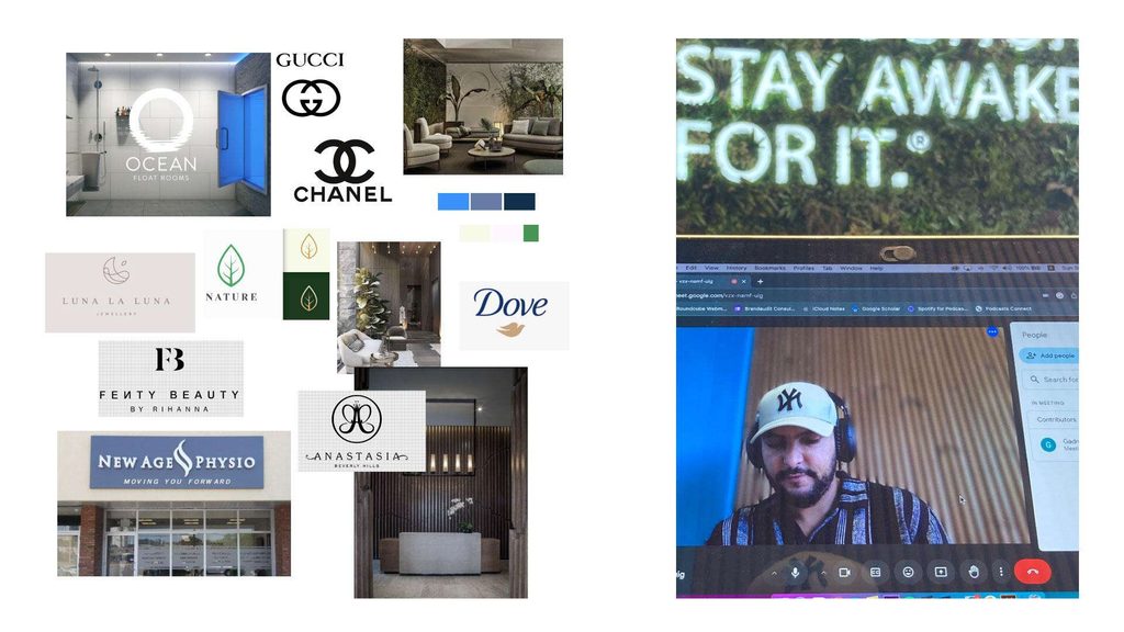
As always, the workflow starts with a strategy call where we define all the goals and analyze all the inputs we have, like the brand’s objectives and vision, the environment where the branding will live,
and what art direction would best suit the visual system.
From there, we build a moodboard that gives us a clear sense of the right feel and vibe before moving into execution.
Most importantly, it also helps us identify the core challenge, so that our design isn’t just visually appealing, but also acts as a strategic solution to that challenge.
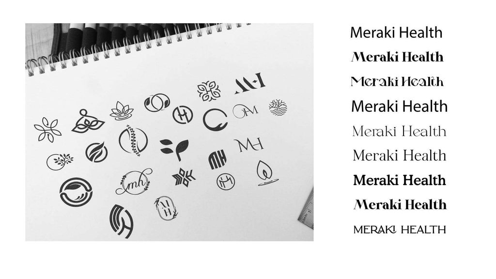
Once we’ve defined the goals and clearly identified the challenge, we move on to the sketching phase where we explore our ideas and evaluate which direction works best.
The initial idea we discussed with the client was to create a monogram logo using the brand’s initials.
However, we also asked ourselves: why not explore an alternative direction, like an abstract icon that visually expresses wellness and relaxation?
The font paired with the logo needed to reflect the keywords and brand attributes we had previously defined, with the full logo conveying a strong premium feel, enhanced by a calming, wellness-oriented vibe.
After laying out all the ideas and exploring the different possibilities, we finally chose one direction to move forward with as the first draft.
We then tested it through mockups to see how it performs in real-world contexts and to evaluate whether it truly feels right and aligns with the brand’s goals and emotional tone.
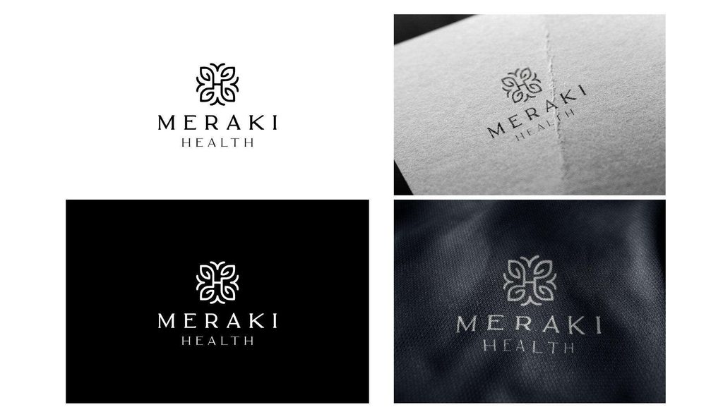
When we reviewed the first draft, we felt that the typography leaned a bit too much toward the conceptual side. That’s why we decided to bring more balance by choosing a typeface that’s less conceptual and more functional, something that could also work better in real-life environments like store signage.
After that, we started working on the color scheme, aiming to reflect the brand’s vision and convey the right emotional tone through carefully chosen colors.
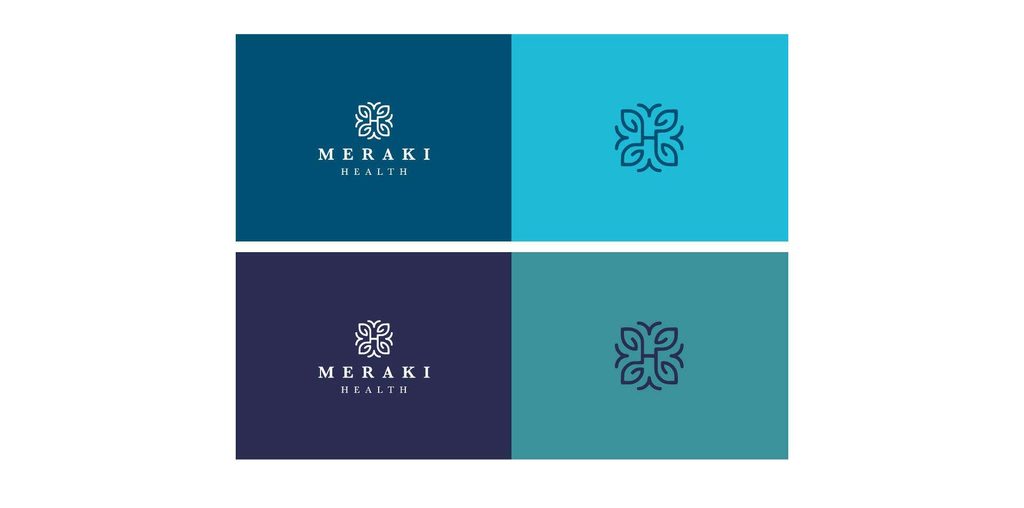
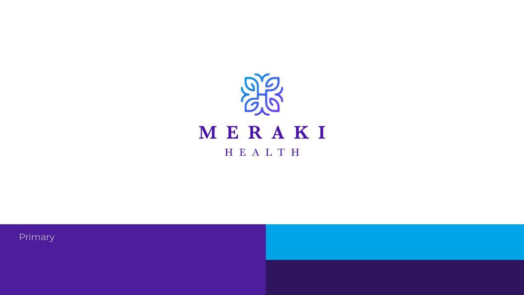
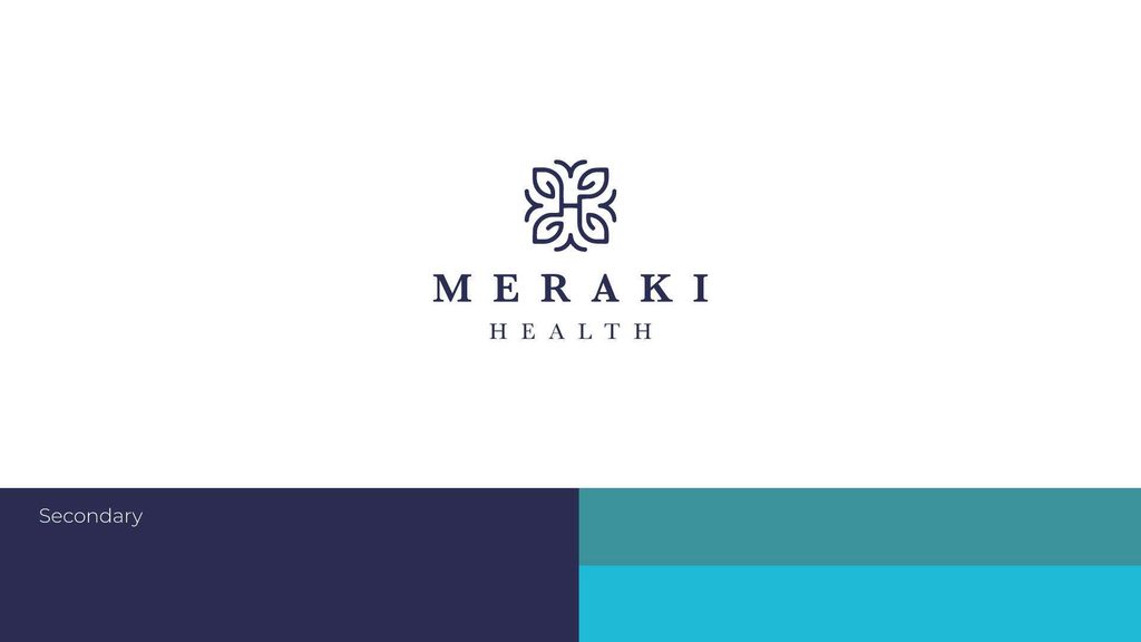
In the end, we decided to work with two color palettes: a primary and a secondary one.
The primary palette is used for digital applications like the website, designed to give off a premium feel and to express Innovation.
The secondary palette is meant for print and on-site branding materials, carefully chosen to evoke a sense of relaxation and wellness within the physical space.
And of course, before moving on to the real-world execution phase, we always create a few mockups to test the direction.
This helps us evaluate whether the outcome actually feels right and aligns with the intended experience
or if adjustments are needed before final implementation.
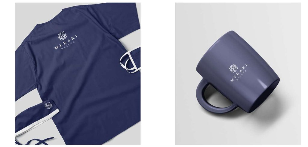
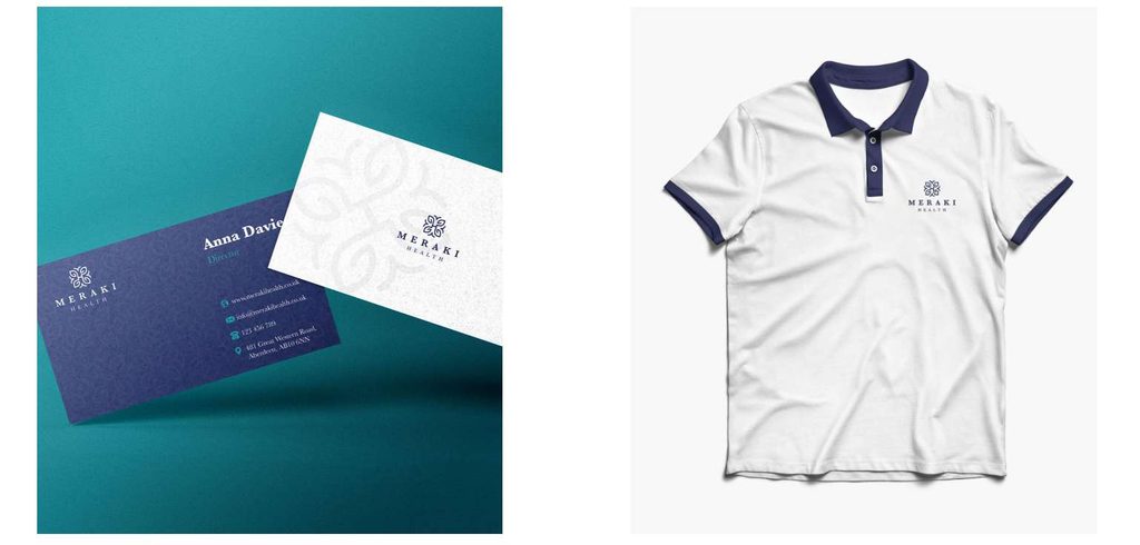
And after we tested everything, the client was really happy with the results we achieved and felt fully ready to enter the market and start operating in the real world.
Thankfully, everything went smoothly, and the brand has been on the right track after a couple of months of real-life execution.

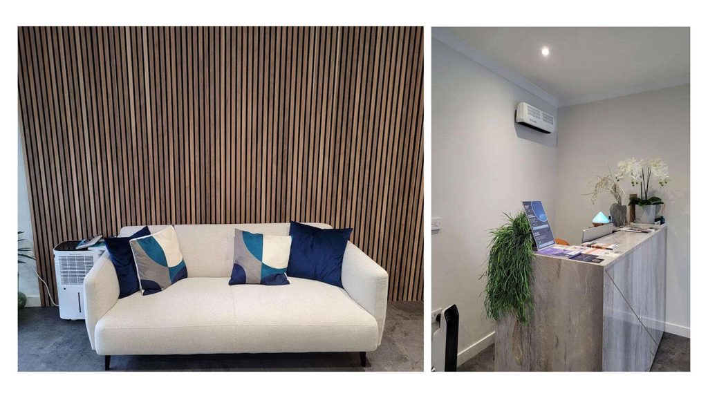
happy customers, happy us 😀
The best thing of all is when the client’s customers themselves are happy and genuinely enjoying the experience.
Design isn’t just about looking good, it’s about enhancing the entire experience.
Because at the end of the day, the one thing we truly aim for is a cohesive, smooth, and thoughtful experience that leaves people satisfied and emotionally connected to the brand.
And I’m genuinely proud that my work plays a part in helping clients deliver that kind of impact.
You can see the rest of the brand in action and how it’s working in the real world.