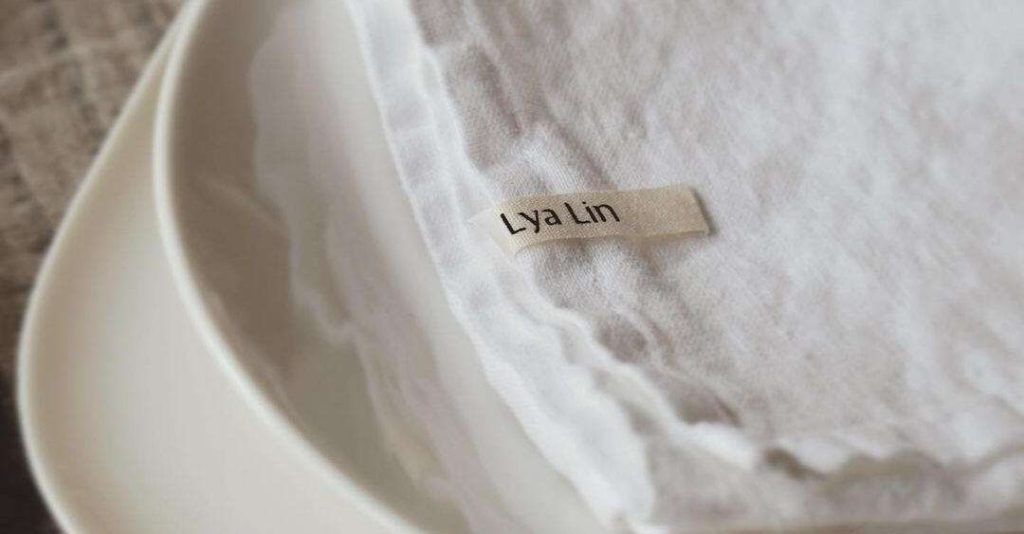
Lya Lin is a textile shop from sweden that offers bed linens, tablecloths, and linen products designed to add elegance and comfort to every room of the home.
My mission for this project was to develop a visual system that aligns with the brand’s vision and communicates its essence with clarity and beauty.
At the beginning of any project, we always start with a consulting and discovery session to define the brand’s goals and understand the client’s needs and the outcomes they want to achieve.
After that, we set the milestones and the rest of the workflow.
I like to keep the workflow smooth and the process simple so that the customer experience is as good as possible for the client.
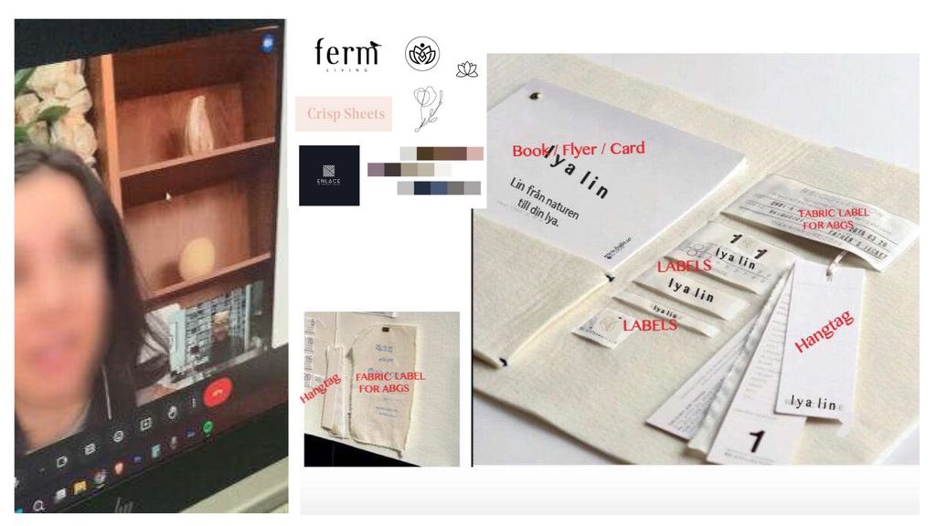
After the first strategy session, we understood the brand’s goals and started a study on the environment in which the brand’s visual system especially the logo would exist.
This step is crucial so we can develop a system that’s responsive and compatible with all kinds of applications, whether digital or on physical objects.
We also defined the art direction for the logo. The client’s idea was to create a logo that includes an icon so it could work well in small spaces.
We also put together a small moodboard to give us the right feel and vibe for the desired outcome.
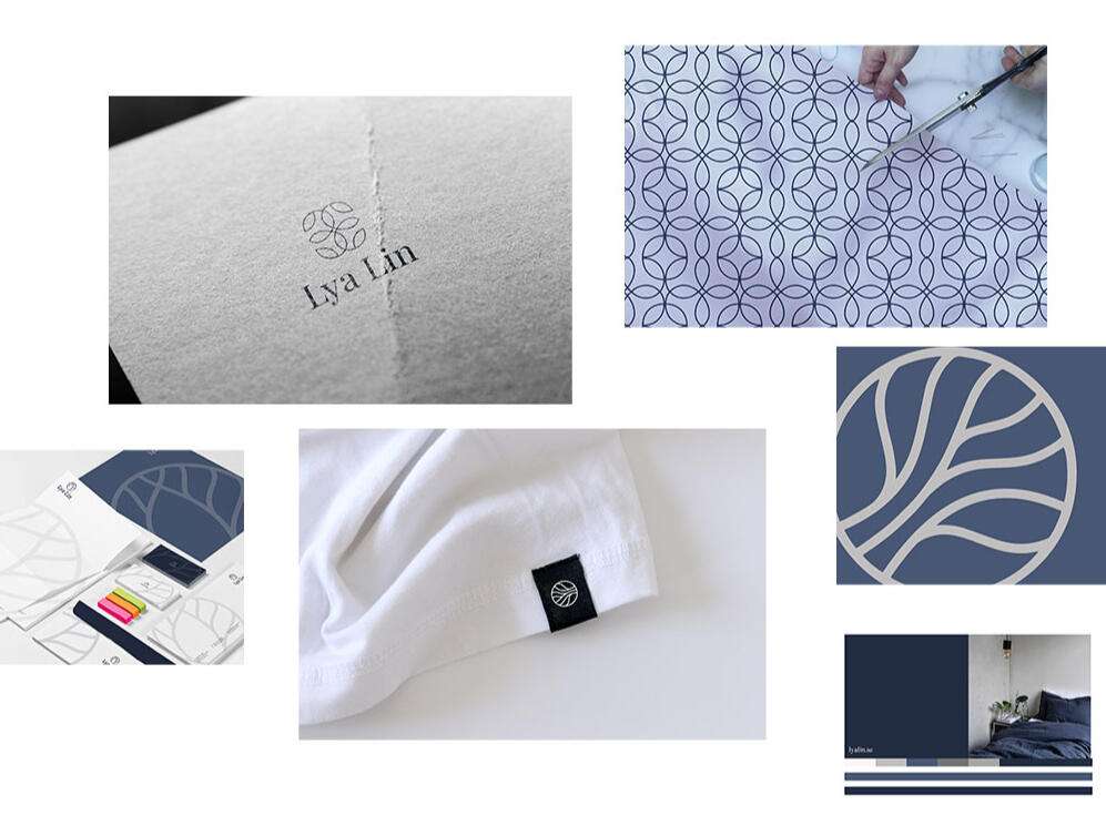
This was the first draft. The direction we followed was an icon-based logo that can be separated, with each element working in the space that suits it best. For example, in small spaces, the icon alone can be used, and when there’s more space, the full logo with the typography and icon can be used together.
We aimed to use colors that feel elegant and reflect the brand’s values.
From the logo, we also derived shapes and patterns that can help the brand become more expressive and dynamic.
Even though the first draft looked clean and elegant, the client later felt that the visual branding’s aesthetic might overshadow the beauty of the products themselves.
Her main goal was to create a product-oriented brand, with the focus more on the product than on the branding.
So the direction we decided to explore was a quieter visual identity, everything minimalist.
The logo would be purely typographic, allowing people to feel the elegance in a subtle way, reflecting the values the client wants to communicate through her products.
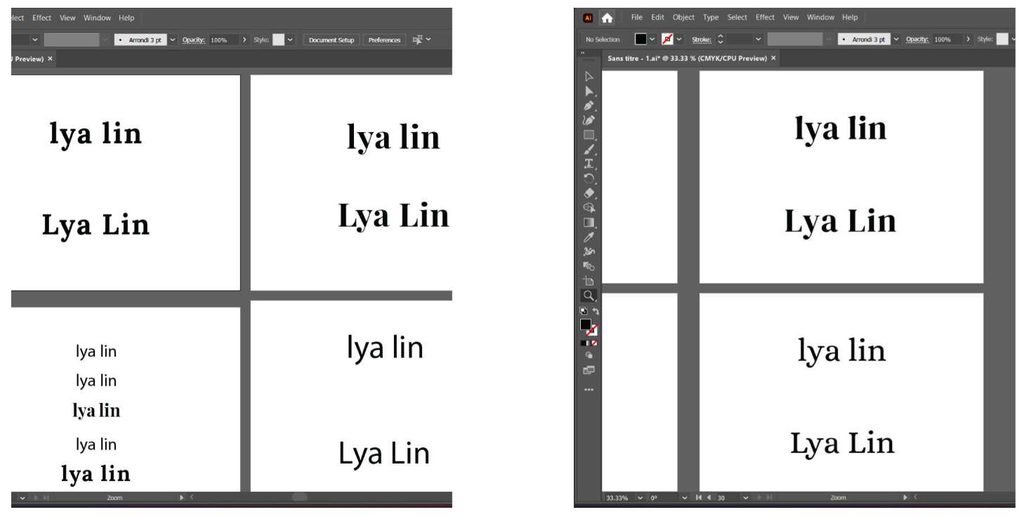
After we finalized the direction (which was to go with a typographic logo) the next challenge was to find a typeface that combines elegance, calmness, and also reflects a sense of craftsmanship, since all of Lya Lin’s products are handmade.
That’s why, when we explored various typefaces that convey those feelings (like serif fonts) we couldn’t find anything that truly captured what we were aiming for.
So we decided to create our own custom typeface, blending elements of a smooth sans-serif with added serifs that form the foundation of that classic, refined look.
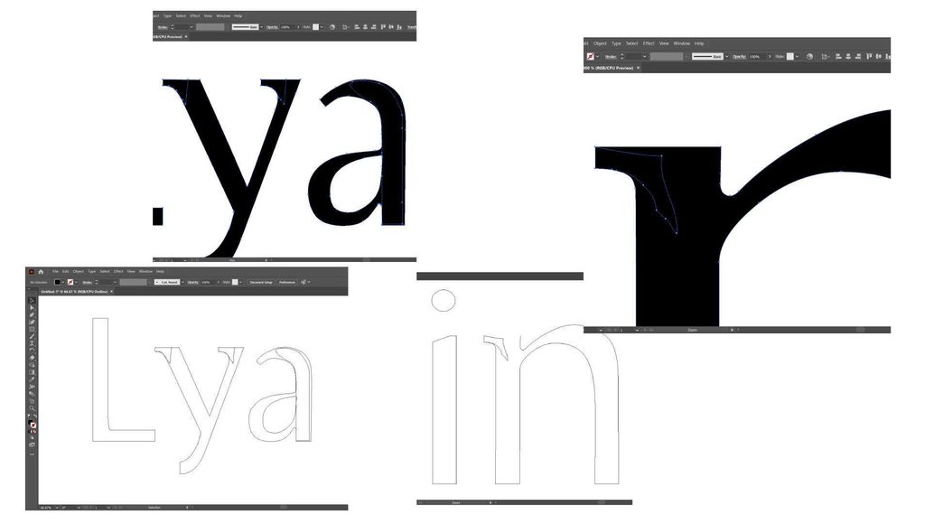
This mix gave us the exact result we were looking for: a logo that’s elegant and quiet, yet also reflects the effort and craftsmanship behind the products.
This is what we showcased in the mockups.
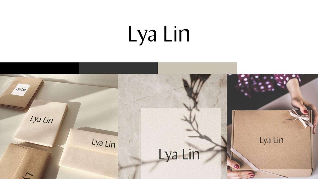
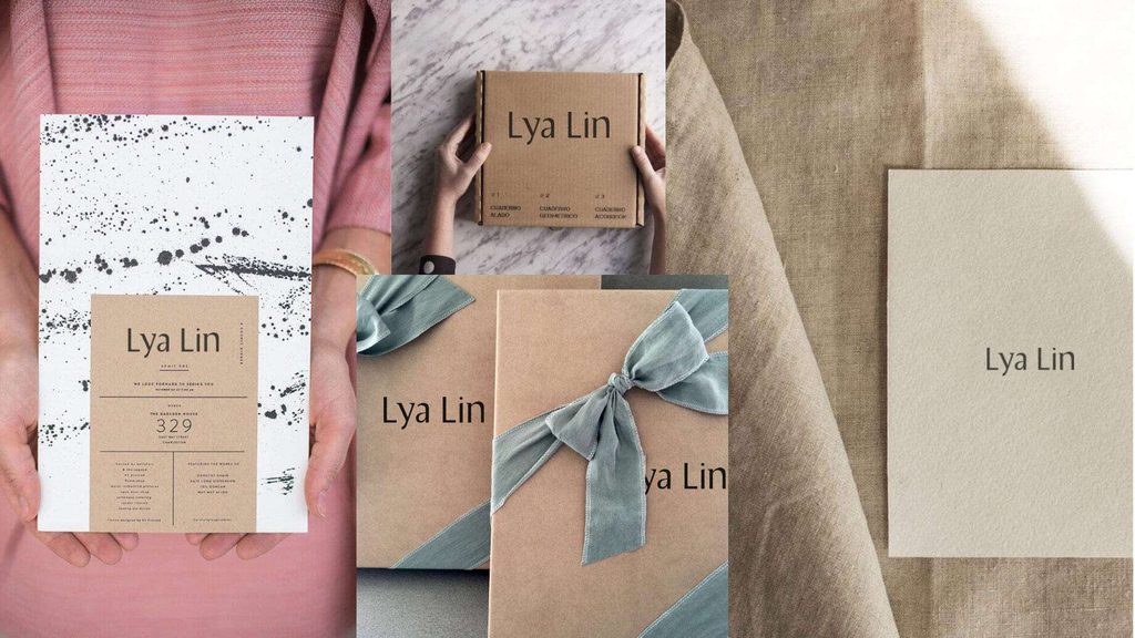
The client was very happy with the results, especially when we reached the implementation phase in the real world, which is the most critical stage. It’s the moment when you really see whether the ideas will work in practice or whether they were just a nice vision on paper.
Thankfully, after a couple of months, we saw that we had truly achieved the result we were aiming for. The quiet branding direction worked beautifully and gave a clean, subtle touch to Lya Lin’s products.
It made the brand feel elegant and calm, creating a refined contrast that allowed the products to shine in any space they were placed in.
This was the final result brought to life.
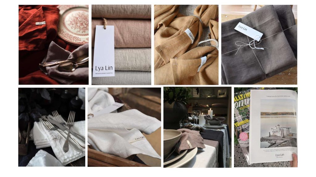
Results speak for themselves
Brand design doesn’t always have to be loud or in your face to be considered good branding. Sometimes, even simple elements, like a custom-made basic font can create a powerful impact effortlessly.
That’s why the most important part of branding is finding the right solutions and ideas that align with our goals, vision, and the emotions we want to convey through our products.
The Lya Lin project is a perfect example of this philosophy. As they say, less is more, and in this case, it truly was.
You can see the rest of the brand in action and how it’s working in the real world.